See the Pen flag of Seychelles w/conic-gradient by Andrew Aquino (@aqandrew) on CodePen.
The other day I saw the flag of Seychelles for what felt like the first time. I suspected that it could be drawn as a CSS background with a conic gradient, and my suspicions turned out to be true.
What do we need to do to make it happen?
Writing accessible HTML
The most practical and accessible way to display a flag on a website is with a static image asset like an SVG/PNG in an <img /> tag, with alt text. That being said, this is a blog post about exploring what’s possible with CSS. That often means creating a div and adding a bunch of styles to it.
Single-div CSS art like this is presentational/decorative. The element functions as an image, so we can make it screen reader-friendly by giving it the role="img" attribute. In lieu of alt text, we’ll also add aria-label="flag of Seychelles".
Construction of the flag

proportions and colors from Wikipedia
Seychelles’ flag has a 2:1 aspect ratio. It has 5 colored bands of blue, yellow, red, white, and green that meet at the bottom left corner. These bands are angled so that the color stops (boundaries between colors) divide the top and right sides of the flag into thirds.
Drawing the gradient
The most basic CSS gradient, linear-gradient(), declares a color sequence along a line. By default, this line goes from top to bottom.
See the Pen flag of Seychelles w/conic-gradient (soft stops) by Andrew Aquino (@aqandrew) on CodePen.
conic-gradient()
conic-gradient() is better suited to this task, since the colors rotate around one point.
See the Pen flag of Seychelles w/conic-gradient (centered) by Andrew Aquino (@aqandrew) on CodePen.
Instead of a line, the colors are now arranged clockwise starting from the 12 o’clock position. It looks like we’re looking down at a multicolored cone from above.
This is a step in the right direction, but we want to finish cycling through these colors at the 3 o’clock position, or 90° from where we started. To do this, we can declare angles for color stops after each color that increase until reaching 90°.
See the Pen flag of Seychelles w/conic-gradient (centered) by Andrew Aquino (@aqandrew) on CodePen.
Even though our last color stop is at 90°, the conic gradient continues clockwise with the last color all the way back to 12 o’clock (360°). Since we’re only interested the upper right quadrant of the gradient, we can hide this extra green region by setting the gradient position (tip of the cone) to at bottom left before declaring our colors.
See the Pen flag of Seychelles w/conic-gradient (wrong angles) by Andrew Aquino (@aqandrew) on CodePen.
Hard stops
A neat trick for CSS art is drawing gradients with hard stops. They don’t look like conventional gradients, which interpolate between the colors you specify. You can use hard stop gradients to make all sorts of patterns including checkers, plaid, and halftone dots.
See the Pen flag of Seychelles w/conic-gradient (wrong angles) by Andrew Aquino (@aqandrew) on CodePen.
We define hard color stops by providing two angles for every intermediate color instead of one angle. (The first and last colors can still just have one angle each.)
.seychelles {  /* ... */
  background: conic-gradient(    /* ... */    var(--blue) var(--stop-1),    var(--yellow) var(--stop-1) var(--stop-2),    var(--red) var(--stop-2) var(--stop-3),    var(--white) var(--stop-3) var(--stop-4),    var(--green) var(--stop-4)  );}
It’s implied that the first color starts at 0°, so its angle means “stop this color at this angle”. In this case, “stop the blue color at 1/5th of 90°”.
For all of the following colors, the two angles mean “start this color at the first angle”, then “stop this color at the second angle”. The green color stop just says “start the green color at 4/5ths of 90°”. Since it lacks a second angle, it’s implied that green continues clockwise for the rest of the gradient.
Getting the color stop angles right
Aren’t we finished?
Nope. In our latest iteration, the top of the flag contains four colors, and the right side contains two colors.
Recall that the four color stops divide the top and right sides of Seychelles’ flag into thirds. In other words, the top of the flag should contain three colors, and the right side of the flag should also contain three colors. We can obtain the angles needed for this by calculating these proportions and feeding them into the arctangent (or inverse tangent) function.
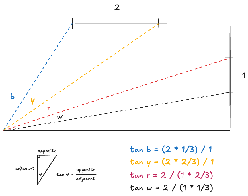
In plain English:
- The blue color stop intersects the top of the flag at 1/3rd of its width from the left.
- The yellow color stop intersects the top of the flag at 2/3rds of its width from the left.
- The red color stop intersects the right side of the flag at 2/3rds of its height from the bottom.
- The white color stop intersects the right side of the flag at 1/3rd of its height from the bottom.
Which arctangent function to use?
atan() has been supported in CSS baseline since March 2023. At first I thought I could define the blue color stop angle like so:
.seychelles { /* ... */ --stop-1: atan((var(--width) * (1 / 3)) / var(--height)); /* ... */}This makes the flag disappear!
It took some digging to uncover (see StackOverflow, CSS spec) that division in CSS is only valid if the divisor (right side of division expression) is a <number>, i.e., unitless. What this means is that you can’t divide by a variable whose value is 100px, for example, since CSS’ type system recognizes 100px as a <dimension>. Just as important, atan()’s argument must also be a <number>.
Luckily for us, the atan2() function has been supported in CSS for just as long as atan(). Instead of one argument representing a ratio, this function takes two arguments representing the y- and x-coordinates of a point. Unlike atan(), each argument can be a <number>, <dimension>, or <percentage>.
Here’s the same CodePen from the top of the article, containing the finished flag of Seychelles, so you can see how it all comes together.
See the Pen flag of Seychelles w/conic-gradient by Andrew Aquino (@aqandrew) on CodePen.
You may notice that the edges between colors are jaggedy, or lack anti-aliasing. This is just a quirk in the implementation of gradients with hard stops. You can fudge the spacing between stops to make these edges look a little smoother, but I chose not to.